It’s been a journey.
Over the past year, since Babyscripts acquired iBirth, we’ve been working on a product that would merge our favorite aspects of both mobile apps while delivering something beyond what we’ve ever created before.
We set out to build a product that truly represents our story and implements the lessons that we’ve learned in five years of being the leading virtual care solution for obstetrics.
A product that is deeply personal and unique to each mother, while supporting closer ties with providers and caregivers than ever before.
A product that embodies the mission and values of our company.
A product that resonates with our origins and looks forward to the future.
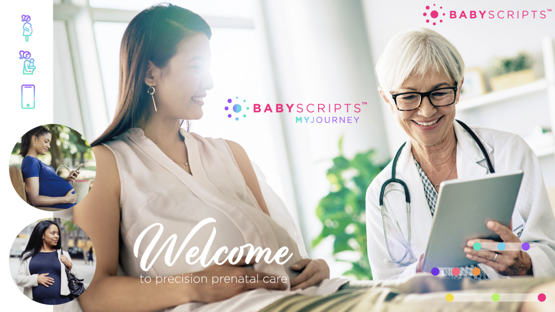
A product that we’re calling Babyscripts myJourney.
A New Generation
So what was wrong with the old Babyscripts platform? Why are we moving on?
We loved our original product and it was the right one for the job, but as our mission at Babyscripts has grown and expanded, so has the vision for our product. We see Babyscripts myJourney as the natural evolution of our existing programs, not a replacement, and one that will seamlessly integrate into the workflows that our clients already have in place.
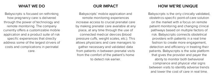
Babyscripts myJourney features expanded content, an integration first strategy, and inpatient offerings, with an improved technological architecture to respond to the needs of our patients and providers.
With vibrant and engaging content that now extends up through a year postpartum, Babyscripts myJourney supports a patient in the critical periods when a mother is at the highest risk for maternal health complications, and an improved platform streamlines the process of supplementing the myJourney app with risk-related experiences and remote monitoring.
A Comprehensive Brand Strategy
The excitement of bringing such a great product to our clients was palpable, but in the midst of that excitement and under the pressure of meeting sales demand, we were in danger of losing sight of something: the importance of our brand.
We took a step back to make sure that the look and feel of the product reflected our mission just as much as the product itself.
 We’re proud of where we’ve come from. #BabyscriptsPink and our logo have come to represent innovative solutions that providers, payers, patients, and investors know, trust and respect.
So we asked ourselves, how can we differentiate our new product while staying true to our roots?
We tried a lot of things — we brought in dark blue, we added more pink, we experimented with a totally new design for our MommyKit — but it all felt very haphazard and inconsistent, two words that don’t resonate with Babyscripts and our mission.
And that was the key. We realized that our brand strategy had to be rooted totally in our mission. We needed a visual experience that truly reflects our vision and goals.
Back to the Beginning
So we evaluated. What is our story? Our impact? What makes us unique? What are the values that define us?
And then we took those questions to the people who know those answers better than anyone else: our employees, our customers, and our patients.
After surveys, conversations, interviews, brainstorming sessions, chats over the water cooler, here’s what we came up with:
Consistently, we heard that Babyscripts =
INNOVATIVE
MISSION-ORIENTED
CLINICALLY-VALIDATED
PATIENT-CENTRIC
The Story of a Product
We recognized that the look and feel of Babyscripts myJourney had to be fundamentally rooted in the story of our corporate vision, while reflecting its evolution and growth from our original solution.
So we took some time to reflect on the enhancements that Babyscripts myJourney delivers to our customers and users:
- More customization for clients in colors and content
- Visually appealing content that includes embedded videos and images
- Extended content that continues through 1 year postpartum
- More technically flexible, allowing clients to embed the app within their own health system app, integrate with the medical record, etc.
In short: flexible, vibrant, engaging, and personal.
We had our blueprint: a clearly articulated corporate vision; a defined personality for our new product; and underpinning both of these, the diverse and personal nature of pregnancy itself.
A New, Old Look
We took that blueprint to a design company that understood our story and shared our passion for a visual strategy that would truly reflect that. Together we created a cohesive brand that we’re incredibly excited to share with our customers.
First, an expanded color palette:
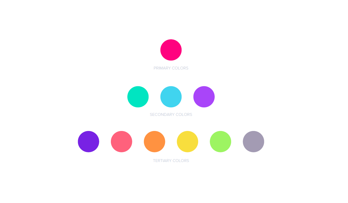
#BabyscriptsPink still plays the primary role in our palette, keeping us connected to our roots, and a wide range of additional colors reflect the vibrancy and flexibility of Babyscripts myJourney — nine diverse colors that align with the nine moons of our logo, and more importantly, the nine months of pregnancy. The variety of colors embodies the uniqueness of every pregnancy journey.
Then, a new logo:

Our logo for Babyscripts myJourney repeats the nine moons of our corporate logo, representing the nine months of pregnancy. It integrates aspects of the new color palette, with a gradient to represent the gradual and diverse nature of every step in the pregnancy journey. The font of myJourney aligns with our Babyscripts font, while differentiating itself through this same color palette and gradient.
The modern look and feel of our logo reflects the needs and desires of our moms for a convenient, modern solution to managing their pregnancy, and it translates equally well to collateral and to the App Store.
Next, design elements.
![]()
![]()
![]()
![]()
![]()
![]()
We carried this playful vibrancy to our iconography, keeping the fresh color palette and gradient in play, and tying everything together with a #BabyscriptsPink point that nods to our corporate vision and the digital touchpoints of our solution.
What’s Next
Over the next few months, you’ll see the other visuals around Babyscripts aligning around this new direction: on the website, on the socials, in advertising, and in our product.
We’re excited to keep bringing better pregnancies to moms everywhere; with a fresh, modern, and diverse look that truly reflects what we stand for, where we’ve come from, and where we’re going.
Thanks for sharing in the journey.
Submit a comment