In the latest of several enhancements to our product, Babyscripts myJourney is adding customized illustrations to modernize and equalize the consumer experience of the app. Margaret Fu, lead UI/UX designer at Babyscripts, explains the rationale behind the changes, how these new graphics promote a more inclusive portrayal of the pregnancy journey, and how our customers can benefit from the dynamic and flexible design.
Why did Babyscripts decide to add these illustrations to the app?
Based on competitive and market research we’ve done, many medical apps today, whether it’s B2C (business-to-consumer) or D2C (direct-to-consumer), are using illustrations to modernize the experience for consumers. In user interviews with our patients, they shared other pregnancy apps they use in conjunction with Babyscripts, many of which feature colorful graphics.
Babyscripts sets ourselves apart from these offerings in that our content is approved (and sometimes written) by the patient’s own provider, and we connect patients to their provider directly through remote monitoring. But patients also told us that if they could, they would prefer to just use one app instead of splitting their attention across multiple.
.png?width=1600&name=We%20thought%2c%20a%20medical%20app%20approved%20by%20your%20doctor%20doesn%E2%80%99t%20have%20to%20feel%20cold%20and%20super%20clinical.%20If%20a%20patient%20were%20to%20replace%20all%20their%20pregnancy%20apps%20with%20just%20Babyscripts%2c%20we%E2%80%99d%20at%20least%20want%20the%20experience%20to%20feel%20a%20(1).png)
Can you tell me a bit about the design elements/color scheme, etc?
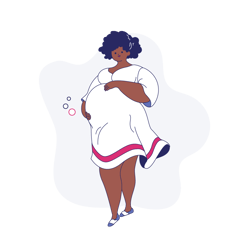
Our illustrations have a degree of whimsy to them, and that was a deliberate choice. We want to keep them light, friendly, and approachable. We use a mix of character illustrations, which are modeled after patients, and slightly more whimsical designs like a stork delivering a package. The illustrations are 2-color, aside from skin tones and outlines.

What was the reasoning behind these choices?
Certain actions in the app, such as entering insurance information, inputting a shipping address, or taking a blood pressure can sometimes feel like dry tasks. The illustrations are meant to complement what we have on-screen and draw attention to the copy, which explains the importance of completing those tasks during a patient’s pregnancy journey.
We also want to make our email communications to patients more accessible and dynamic. Before this change, our email communications were very text-heavy. Using illustrations breaks up the monotony and helps patients quickly scan the difference in content between templates.
Why not use stock imagery? 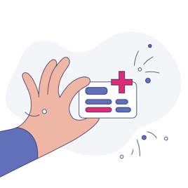
We decided to go with custom illustrations because stock sites today do not offer comprehensive and consistently drawn illustrations around all the areas of pregnancy that we cover. There’s the usual illustrations on stages of development for the baby, but no complete set around actions like taking a blood pressure, providing insurance information, shipping a device, assessing mental health, or being rewarded through Payer incentive programs, all of which we cover in the app.
You mentioned that the illustrations are two-color, aside from skin tones and outlines. Why is that?
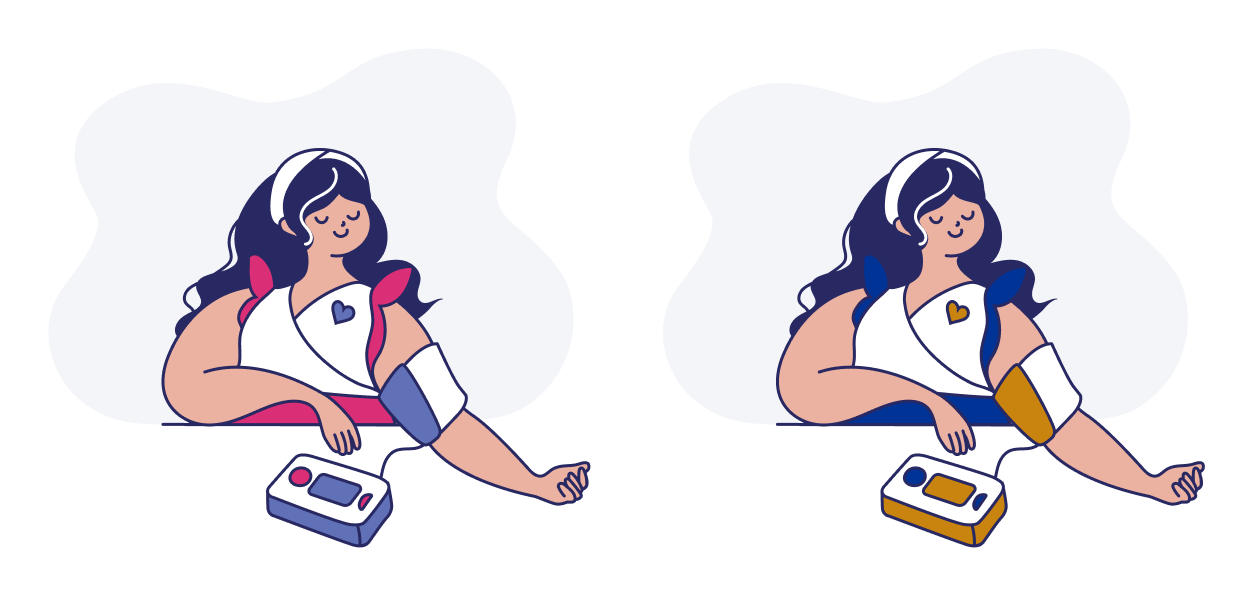
Keeping the illustrations 2-color allows us to dynamically “brand” the drawings in code. Our customers have the option to enter a primary and secondary custom color for their group. If they choose, our illustrations can reflect the colors they request so their branded look carries throughout. For example, the Babyscripts default colors for the illustrations are rose and periwinkle. But a group from a health system that has blue and gold branding will have patients seeing a blue and gold version of the illustration.
Are there plans to make further graphic changes in the future?
Yes, our next round of illustrations will cover some of our new product offerings currently in the works, and illustrations for error screens. Down the line we also intend on having more illustrations for our Babyscripts standard content library. Some complex or abstract content can benefit from extra visual aid for our patients to grasp the idea.
 What is the importance of these changes for diversifying the customer experience?
One of the several reasons we chose to go with custom illustrations is because of the lack of diversity in pregnancy stock photos and graphics. We want to showcase different skin colors, body shapes, ethnicities, or disabilities. Our patients come from a wide range of backgrounds. This decision aligns with the work we are doing in accessibility auditing, and ensuring that our content library has inclusive language.
It also gives us more control over how to depict our patients at various stages of pregnancy in the app. If we want to segment our patient communications to first, second, or third trimester patients only, we can display the appropriate illustration for that.
[Read: Babyscripts Focuses On Diversity and Accessibility in Latest App Refresh]
We are also aware that even though we are a pregnancy company, we have patients who have suffered from a loss and might not want to see images of a mother holding a baby. Or that postpartum patients can also be remotely monitored, and they do not look the same as a patient who is in their third trimester. All these little nuances go into what kind of illustrations we create and where we use them.
Submit a comment